Refining accuracy
For Maitank
Laura Salvà, founder of Maitank, a design studio based in Mallorca, commissioned us to re-touch the logotype she had designed for her studio. We started by observing some inconsistencies in weight and shape, as well as general colour imbalance.
We retouched some letters in order to match the weight of the rest of the letters, and adjusted the spacing. The word studio was very small, becoming illegible at small sizes, so we gave it a bit more presence.

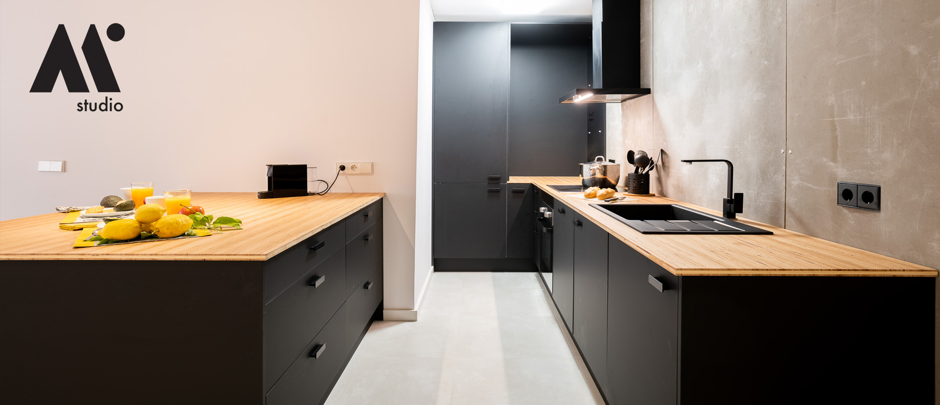
In the case of the M symbol, we used the retouched M, incorporated the dot of the i, which we saw in a previous version designed by Laura, and thought it added personality helping distinction as well as, together with the M, forms a mountain with the sun resembling the landscape of the area were the studio is based. Here a letter becomes a symbol full of uniqueness which also works very well in small sizes. We made the word studio bigger here too, again in the original version was completely lost in small sizes.

Overall, both the logotype and symbol look more compact and balanced, as well as gained personality and strength.

