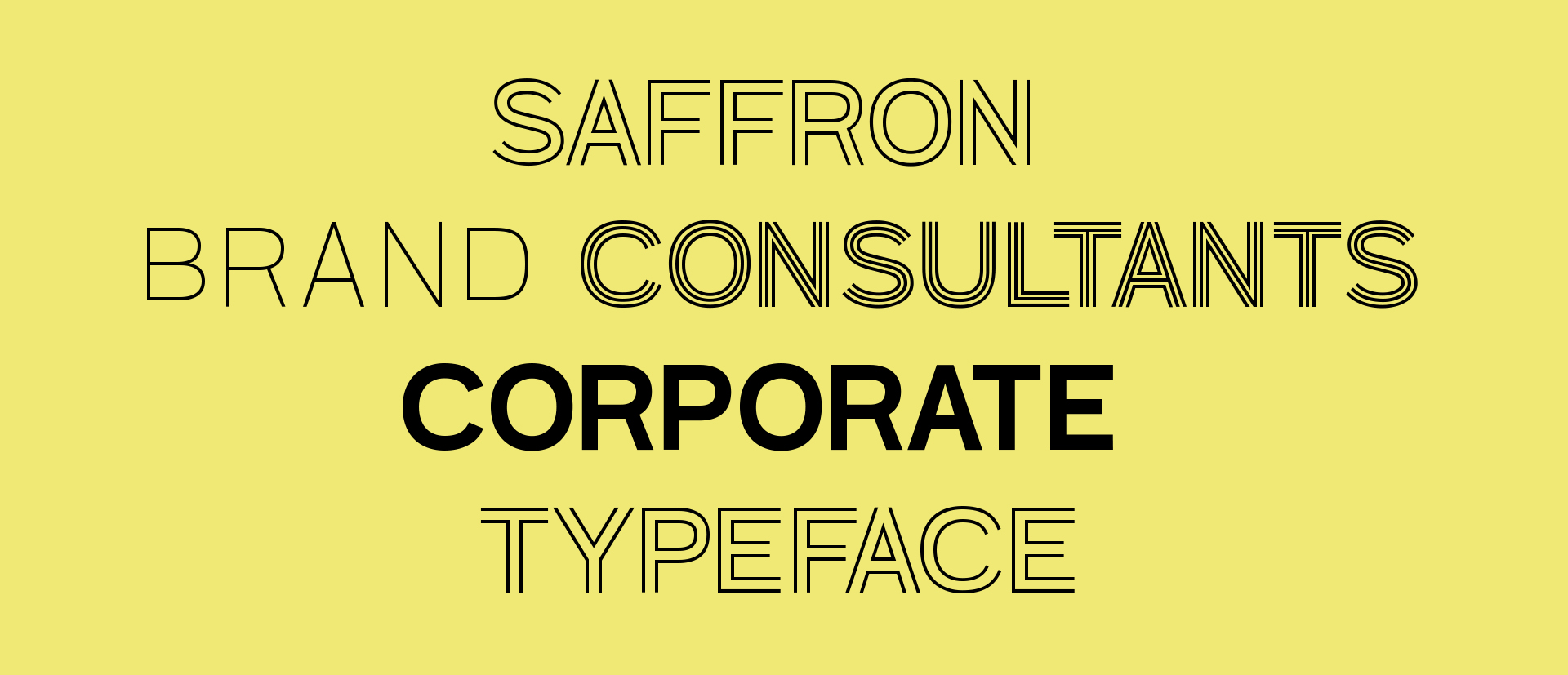
Branding through type
Saffron Brand Consultants re-designed their corporate identity for which they commissioned us the design of a bespoke typeface to be used on their new online and printed materials in order to help them express the concept of their renewed image. The briefing was to achieve the design of a display typeface which represents the concept of Inside (soul, strategy) and the Outside (skin, design) of the company. Working together with Saffron we decide the parameters and the approach of the new typeface, concluding that the font family should include 4 different styles: Outline (representing the skin), Inline (representing the soul), Overlap (Inline and Outline together) and solid (the other three filled in). Because this is a project for a Branding typeface the typeface should have personality, so a lot of effort was put into each solution to obtain considerably different designs pushing the boundaries of the brief. This can be seen not only in the structure of the letter shapes but also in how the Inline and Outline styles interact amongst themselves. As usual, when we receive a briefing we try to go further and bring some of our thinking into the project by experimenting as much as possible. After a creative process and some trials, in this case, we proposed 4 different ideas.
Option A
The idea behind this option comes from the shape of the big letter "F" of the new logotype which has low vertical stroke in order to fit the second small letter "F". By applying the same treatment to the typeface it helps to create a link between the two, logo and typeface. This also bring personality to the design.


Option B
The main idea behind this proposal is to match this typeface for display purposes with the one used for the text "FGrotesk". The design follows similar proportions, but the letterforms are different. It has a more contemporary feel.


Option C
The main structure of this proposal is wide, open and formal. The strokes are very thin in order to give a feeling of lightness suggesting transparency and honesty.


Option D
The main structure of this proposal is a semi-serif, with a more elaborated structure. is refers conceptually to the level of complexity existing in Saffron’s working method and its elaborated projects.


The client choose option B but with some slight modifications, so we started to develop the concept into a whole type family.
Although the design of the new typeface was apparently simple, we had to face some technical issues mainly found in the Inline style.
The first difficulty was found at the height of the letters. In order to overlap well with the outline style, the height of the letters changed on the baseline and Caps height, moving up and down as if the letters were dancing when creating a word or a sentence.
The second issue is related to the spacing. Again, the spacing applied to the Inline weight was design to ensure a good overlap with the outline weight, so they fit well together. This made the spacing looked too tight or too loose when using the Inline style alone.
To sort these two issues, we thought to design an extra uppercase set in the Inline style with a correct Caps height and spacing they could use when they need to set text only with the Inline. However, the client thought that this character's “dance” was suitable for their concept of applying “disruptive thinking” as their brand development method.


The final result is a four style Grotesque typeface which wraps up the initial conceptual idea Saffron had for the image of their studio.