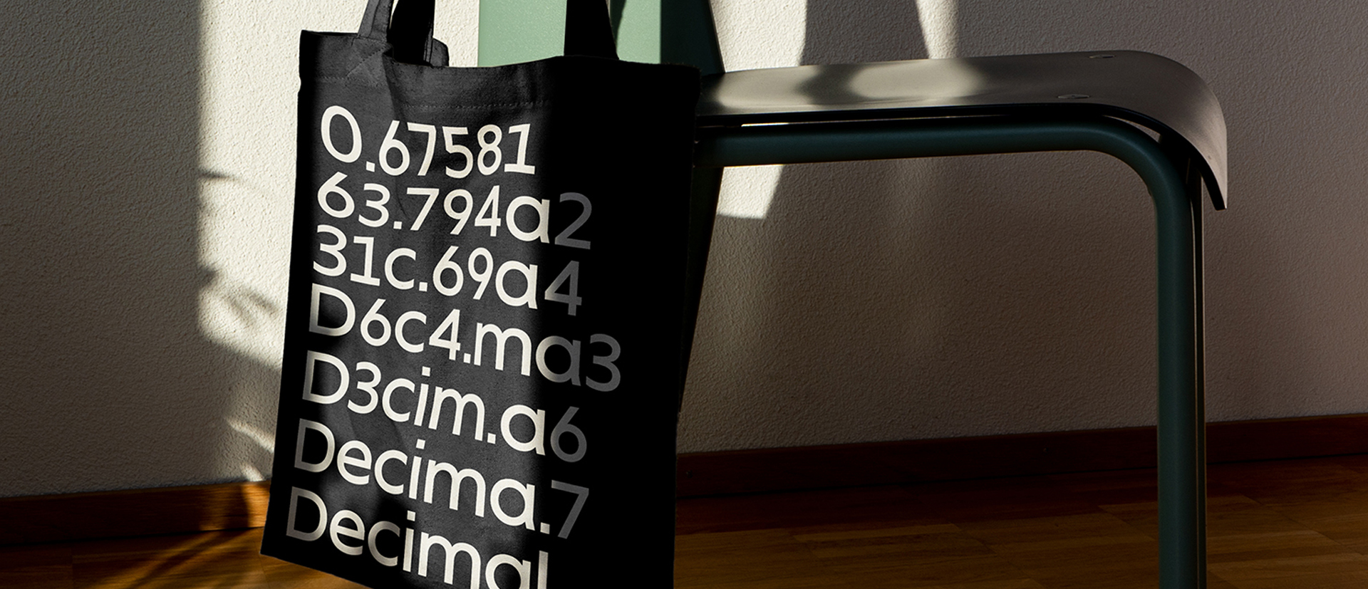
Portada, going to the South East
For TypeTogether
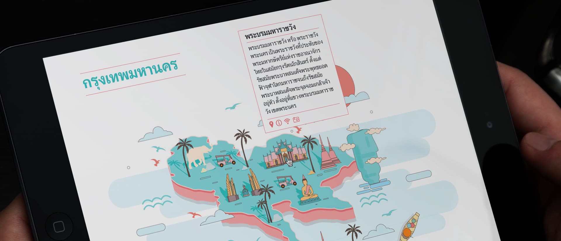
A while ago we teamed up with our friends at TypeTogether to develop a Thai companion for their typeface Portada. This was a very challenging project given that the typeface was designed for a very specific purpose, to be used mainly on-screen. For us has been a very good experience which has allowed us to deepen in our knowledge of the Thai Script.
Our approach to designing a companion for a Latin typeface is analysing the structure, the curves and the details which comprise the typeface. Once we have a map of the shapes we study how and which of those shapes are applicable to the particular writing system and start sketching. This sketching process is a sort of trial-error process in which the structure is decided and curves and terminals are tried out in order to decide which are applied and which are discarded, based on how those feel in the new Script. In a way is an intuitive but at the same time very informed process, in the sense that this intuition does not come out of nowhere, it comes from years of study of the script, observation and previous experience designing it.
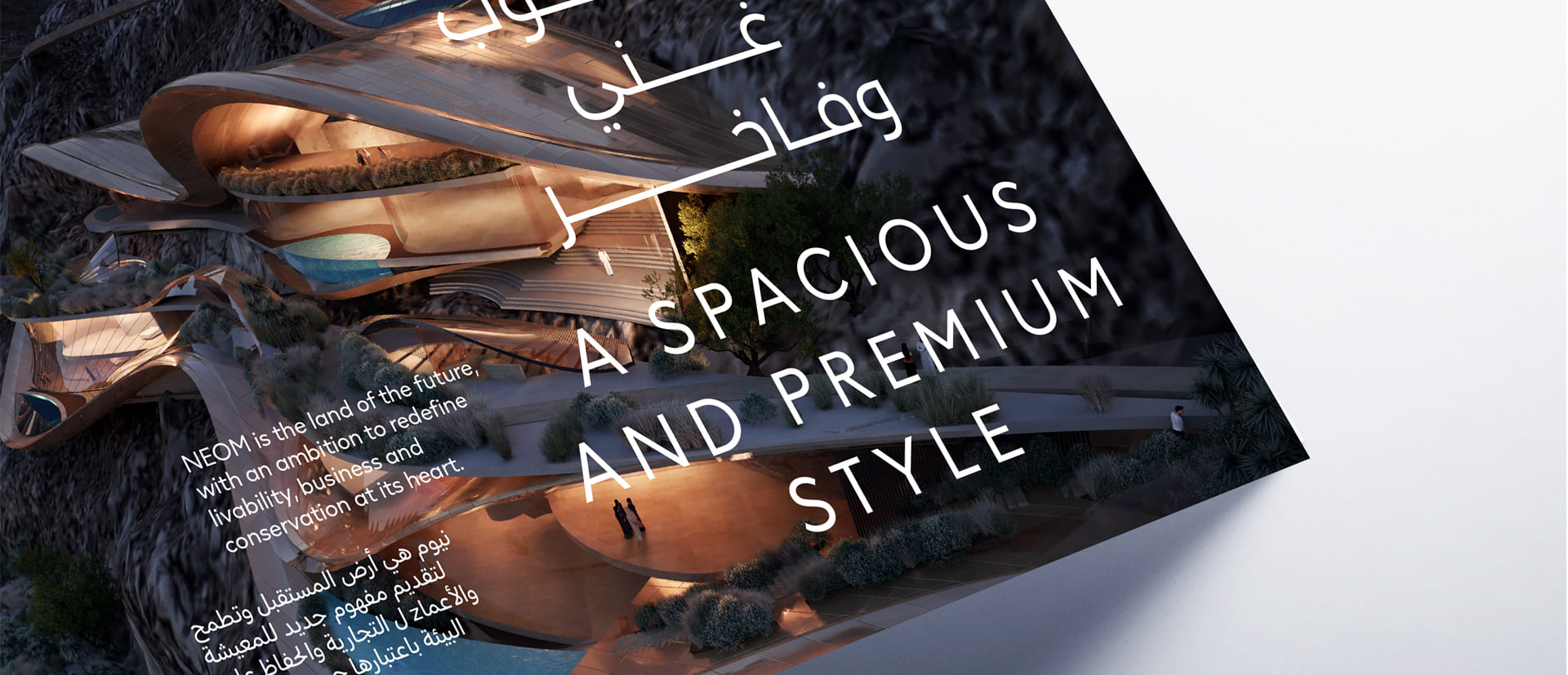
The Thai companion of Portada adapts to the Latin in terms of proportions and colour, also the type of curves match those of the Latin. It has a mechanical look but with a human touch. In terms of style, Portada is classic yet with an innovative touch which makes it feel very contemporary, the Thai follows that approach.
Some details have been taken form the Latin and adapted to the Thai where ever possible, without over doing it and without imposing unnecessary things.

When deciding the proportions of the Thai we have to consider that Thai does not have ascenders of descenders, neither it has upper and lowercase, it is a unicase script. However, it has stacking marks above a base letter and marks below this base letter. Taking all of this into account, Thai needs to be higher than the latin x-height but it has to fall below the ascender’s height. The exact relationship has to be decided by trying out different options and optically decide which is a good relationship in terms of size when comparing both scripts in text.
In Portada’s case the Thai height is just a bit above the x-height considering that the aim is screen use which mean we need to take into account the restrictions of the bounding box, we need room for the stacking marks.

The typeface family has two different versions, Portada Thai and Portada Thai Text. The text version differs from the other one basically on its proportions, the text fonts are adapted for its use in small sizes and long text. Generally speaking it is wider, has a more generous spacing and Portada has two weights more than its text version.