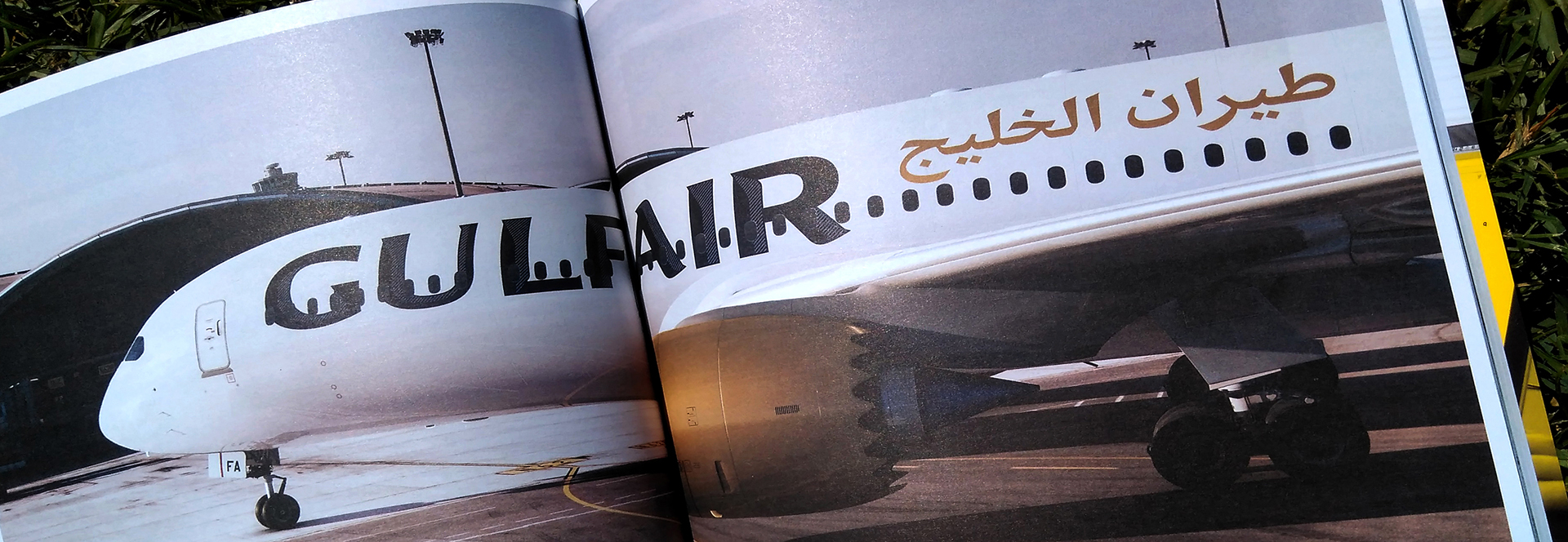
Flying type
A while ago we designed a bespoke typeface for Gulf Air. Seeing your letters in an airplane is somewhat exciting for any type designer, we are very happy with the result.
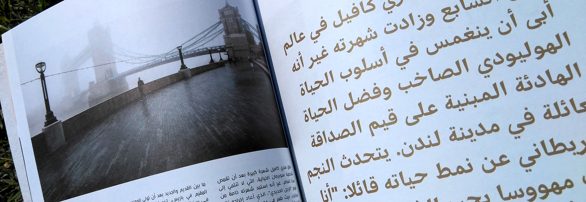
The project consisted in 3 display fonts covering Arabic and Latin. GA Sans is used beautifully across the planes, website and all kinds of collateral materials, including the in-flight magazines.
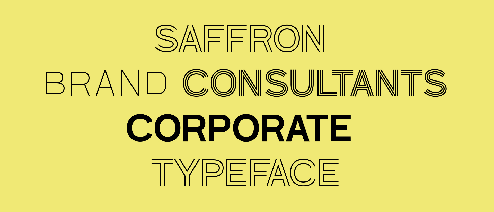
Saffron Brand Consultants approached us in order to translate their brand concept into their new corporate typeface. Their idea was to modernize their classic falcon image and raise the customer experience quality. Regarding the typeface we needed to design a type family which was visually related with the falcon of their logotype, with sharp terminals echoing the claws and beak.
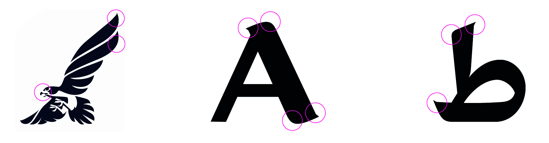
The family also contains a shading font which evokes the details of the feathers of the falcon.

As usual when we work on two or more different writing systems we worked on the details, applying the same terminals where possible. Also we worked on the weight and the proportions.

Overall the brand identity was very carefully thought, and all its elements, logo, typeface, illustrations, interiors.. are beautifully integrated.