A typeface for the future
For NEOM
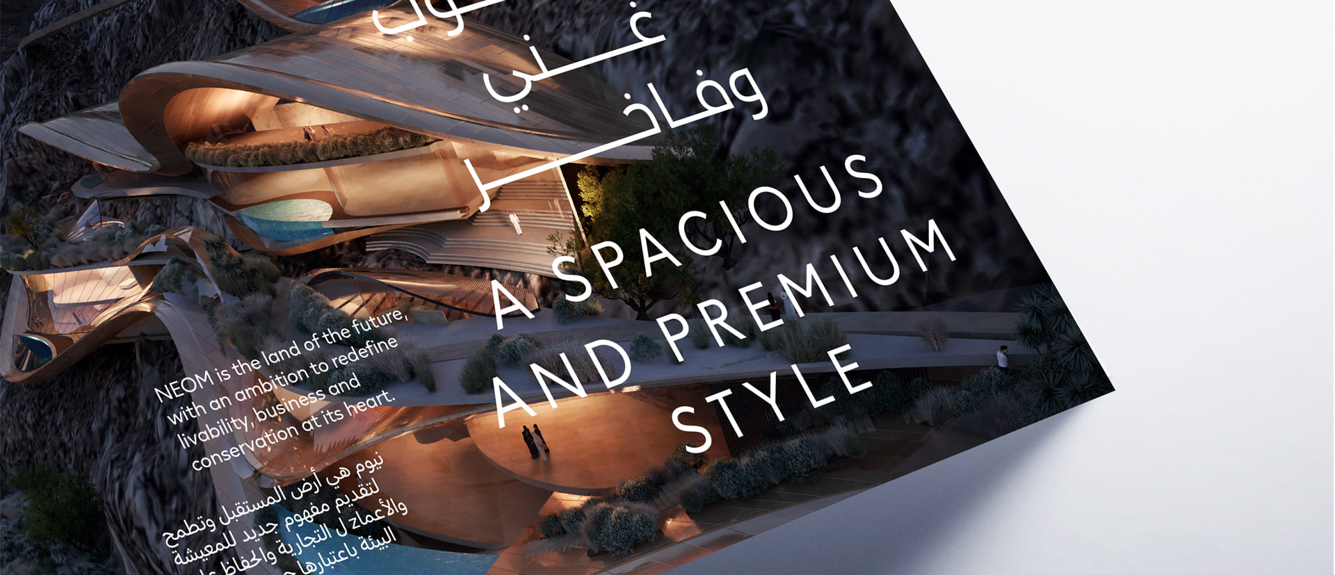
NEOM, the sustainable regional development in northwest Saudi Arabia, aims to solve the world’s challenges and transform how we live and work. As a new global hub for innovation, NEOM commissioned Landor to create a brand identity that echoed its ambition, supported by 5 fluid yet balanced segments—nature, liveability, sustainability, community, and technology—representing NEOM's ambitious vision for the future. Our friend Alberto Romanos from Branding with Type, designed a bespoke typeface family which conveys all these concepts both aesthetically and functionally.

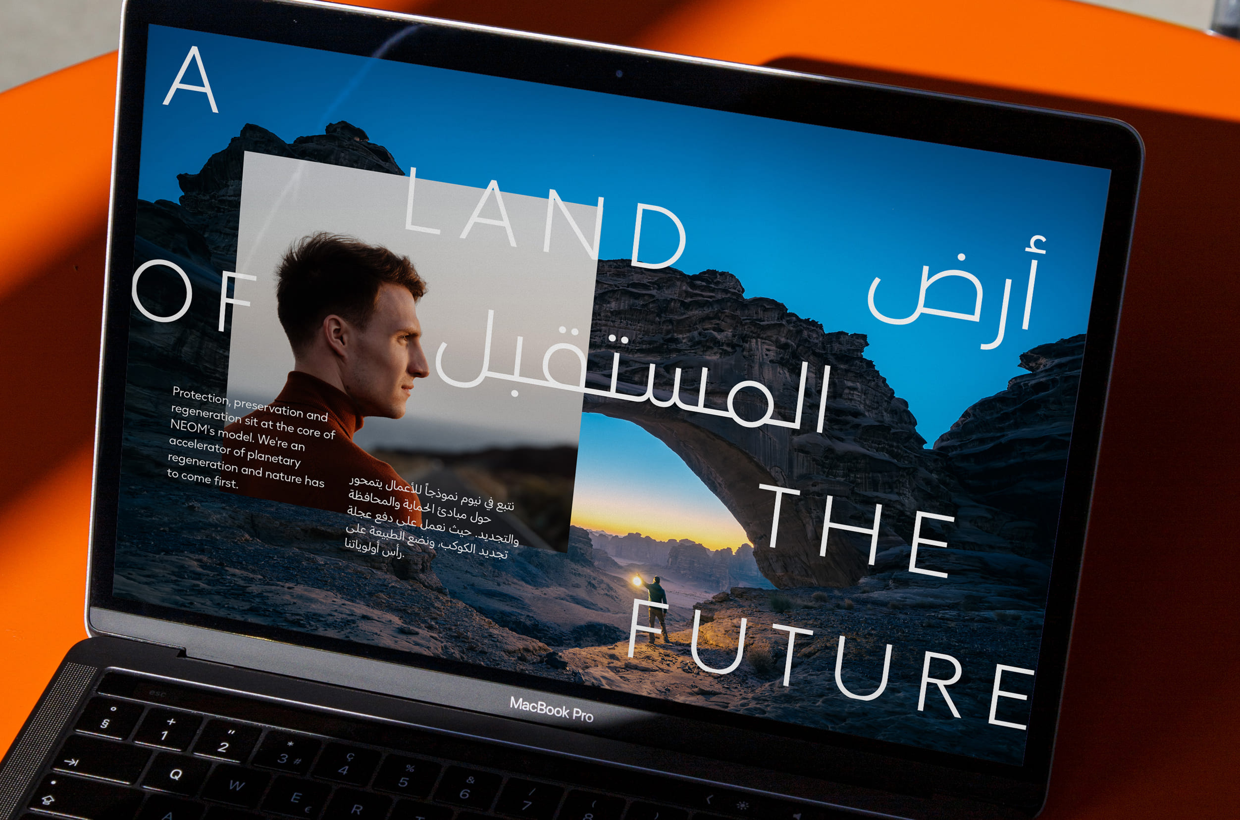
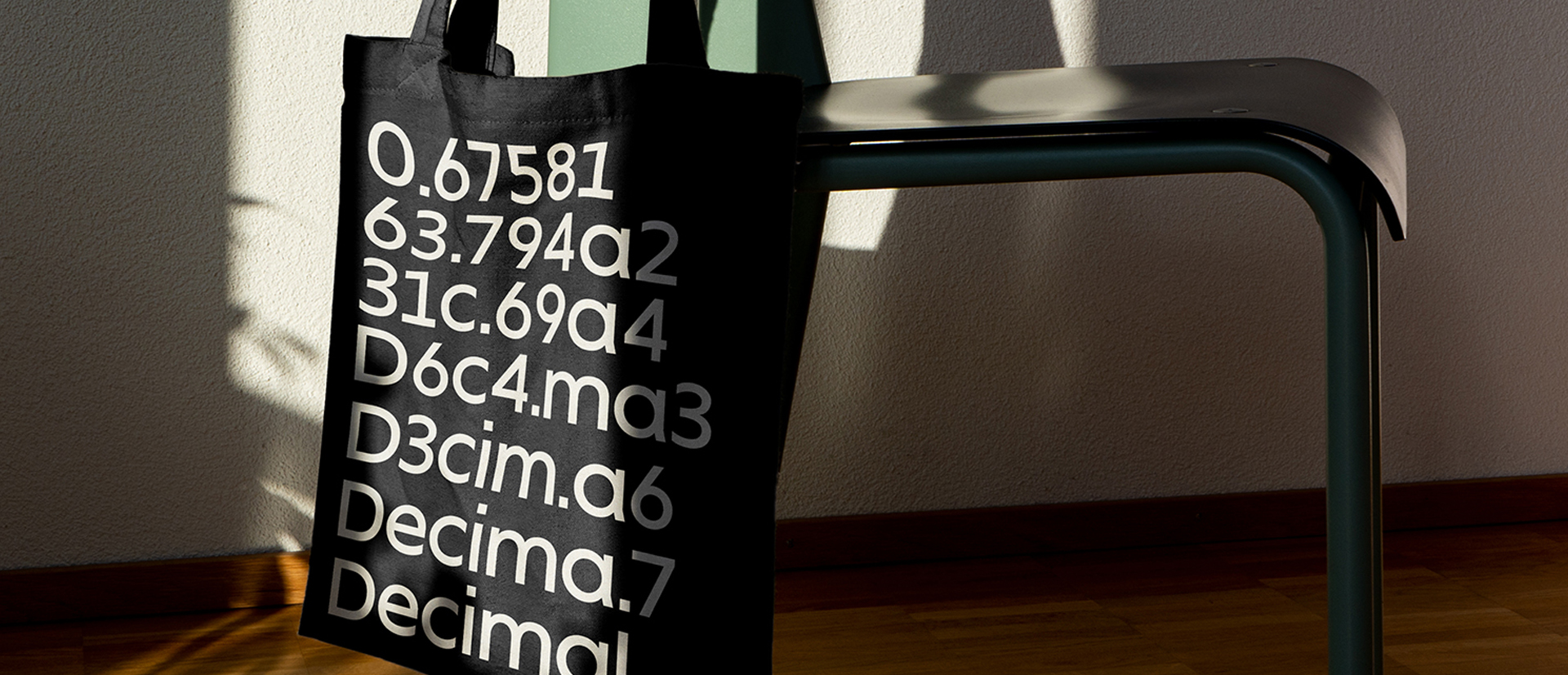
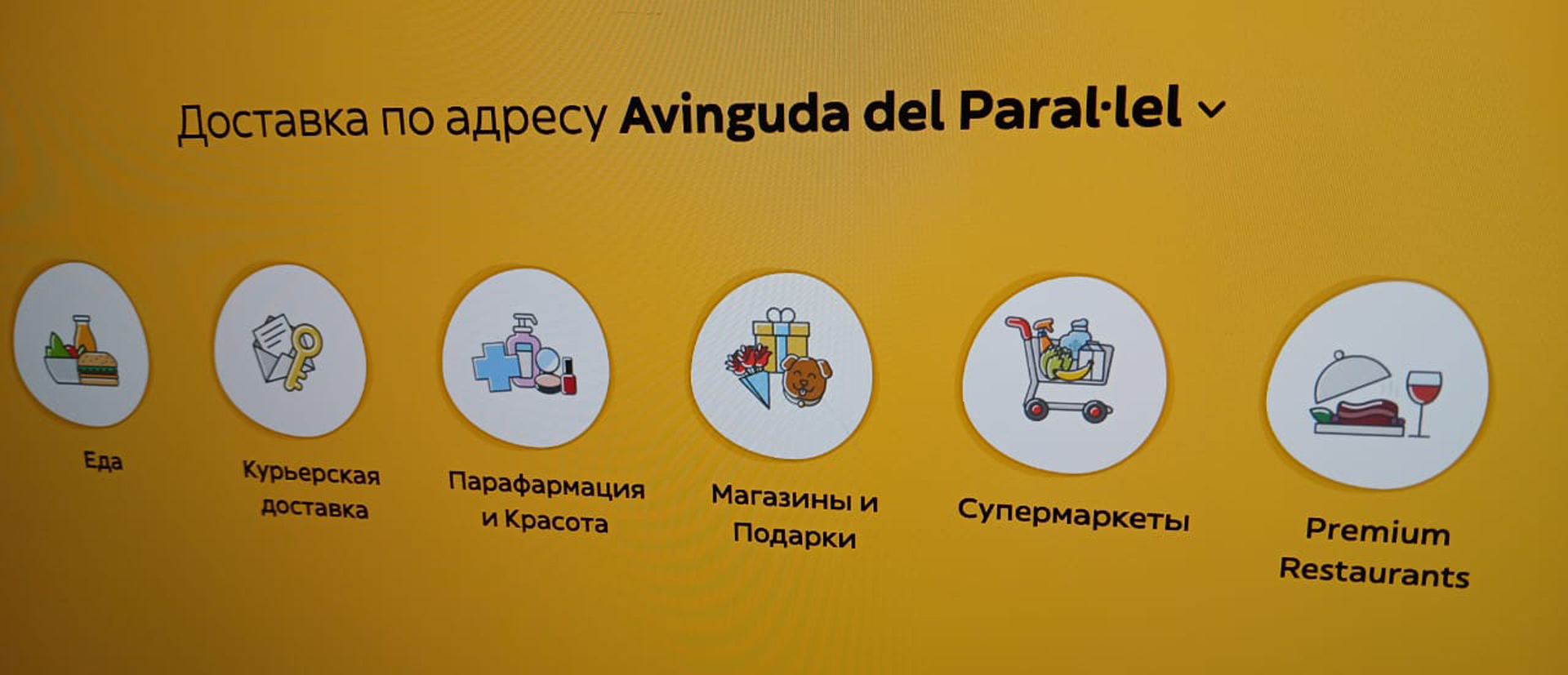
The global reach of NEOM implies they have to communicate in different languages across different writing systems. Before Branding with Type involvement, they were using different typefaces for the different alphabets, causing some technical constraints but also communicating with a different visual tone of voice depending on the language. This was an issue when using Arabic and English at the same time and most of the audience is bilingual. This had to be addressed with the creation of a custom multilingual typeface that could portray the same voice across all the different languages. The NEOM Sans family is a multi-script typeface that has been developed into three different writing systems: Arabic, Cyrillic and Latin. We were asked by Branding with Type to design the Arabic. The client wanted the insight of a native Arabic consultant so we incorporated Nadine Chahine into the project, she gave us feedback and advice through the development of the Arabic.
NEOM Arabic Display It is inspired by the Kufic style and designed exclusively for headlines and logos, crafted to work alongside the Latin and Cyrillic uppercase. Since the Arabic alphabet does not have uppercase, we decided to design the Display version of NEOM inspired by Kufic style, which is based on the construction of complete geometric Arabic letterforms. The geometry of the letter shapes fit well with the geometric shapers of the Latin and Cyrillic uppercase. Also, the simplification of the vertical proportions when using this style (manly four vertical axis) allows for a more open proportion of the characters, giving a good sense of harmony.


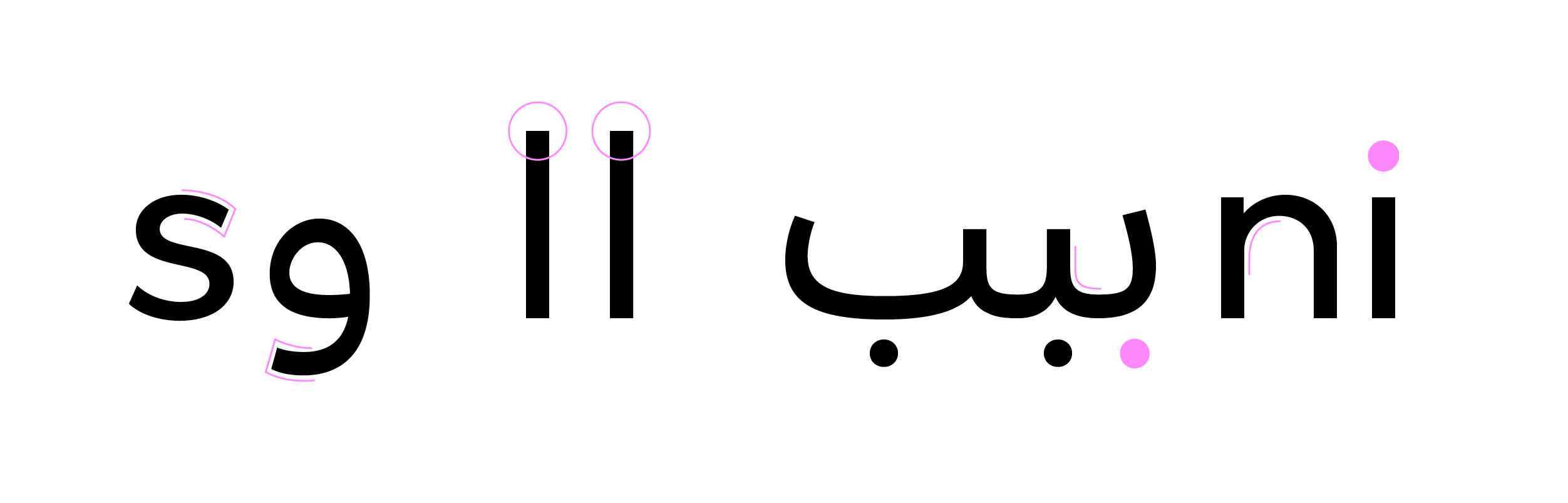
Matching the three scripts was not an easy task, especially with the Arabic script, which looked smaller and flatter when aligned with the top height of the Latin and Cyrillic uppercase.
To create a better match the Arabic letters had to be drawn with much taller vertical proportions. By increasing them, we obtained letters with bigger proportions and more open counter shapes to visually create a better sense of harmony among the scripts.

With the increase in the vertical proportions, we succeeded in creating an Arabic companion with the same visual appearance and voice as the Latin and Cyrillic ones.
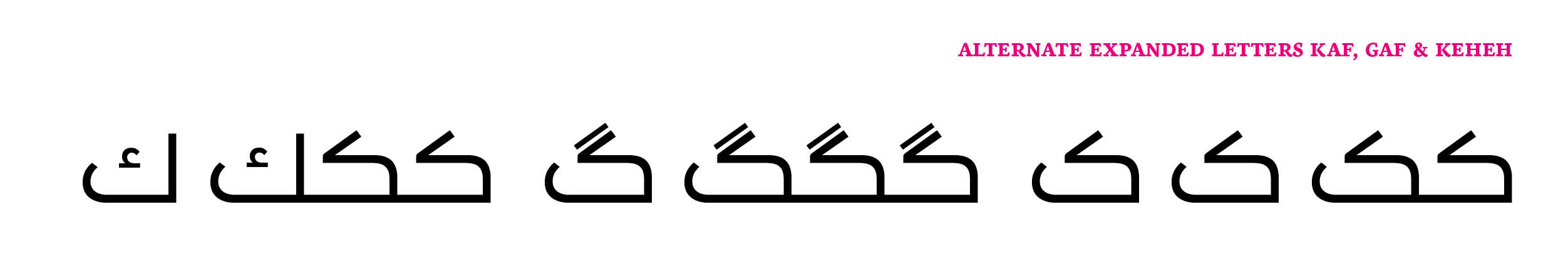
One request from the client was to widen the horizontal proportions in the letters Kaf, Gaf and Keheh. By enlarging them we gain more sense of horizontality when writing a headline. With no need for kashidas, a wide version of Kaf can help to justify a line of text easily without losing much legibility.
NEOM Arabic text is inspired by the Naskh style. In Naskh Style letter shapes and vertical proportions are considerably more complex, showing more variability in the positioning of the vertical axis. However, matching top vertical proportions (ascender line in Latin and Cyrillic) and Alef height (in Arabic script) proves to be a good approach when trying to match in size and colour in Arabic, Latin and Cyrillic scripts.

A more difficult challenge was to give the Arabic new design the same treatment as for the Latin and Cyrillic. The text typefaces made for these scripts followed the design of geometric Sans Serifs, looking very mechanical and minimal in detail. Nashk style, however, is very calligraphic, with a complex structure of the letter shapes and a modulation of the strokes very contrasted. Still, we could find a balanced solution between calligraphy and geometry which suited the new design. The structure of the letterforms was simplified but up to the point where shapes still are very recognisable to the eyes of an Arabic reader. Also, the contrast in the strokes of the letterforms has been kept, but in a more subtle way.

Overall, we created a modern interpretation of the Naskh style, highly legible and suitable for long paragraphs and body copy, matching the visual qualities and tone of the other scripts.
A large range of ligatures were included in the text version to improve legibility.

The result is a multilingual typeface covering the Arabic, Latin and Cyrillic scripts, allowing NEOM to express their tone of voice and personality seamlessly across multiple languages.