Sámpi, when type can make a difference
For Sámediggi
This is a self initiated project which aims to contribute to keep a group of minority languages alive throw solving issues in the education environment.
The idea of this project comes from a personal experience, while living in Finland as Erasmus student I heard about the Sámi people, one of the few indigenous peoples of Europe. They live in what we call Lapland (they call it Sámpi). Their territory goes from northern Norway to Russia, crossing Sweden and Finland, and most of it sits in the Arctic Circle.
Back then I learn a bit about their culture and I was fascinated. Years later, I got a place for a PhD on Sámi typography at the Aalto University in Helsinki, which I finally couldn't carry out. However, during my preliminary research for the application process I got in touch with Hannu Kangasniemi, secretary of learning material at the Sámi parliament in Inari, Finland. He mention that they had a problem when teaching kids their language. The Finish government has an official typeface for education which does not cover Sámi properly and for Saami textbooks it is not easy to find typefaces similar to those recommended by the Finnish education board.
When we started the studio I thought it would be nice to develop a typeface family to give to the Sámi people so they could use it for teaching. Letterjuice started working on Sámpi, a typeface covering all Sámi languages using Latin. We also decided to give them a bigger typographic palette which would enable them to set better typographic quality layouts by adding information hierarchies which will help kids navigate the text easier which will ultimately help them in their learning process.
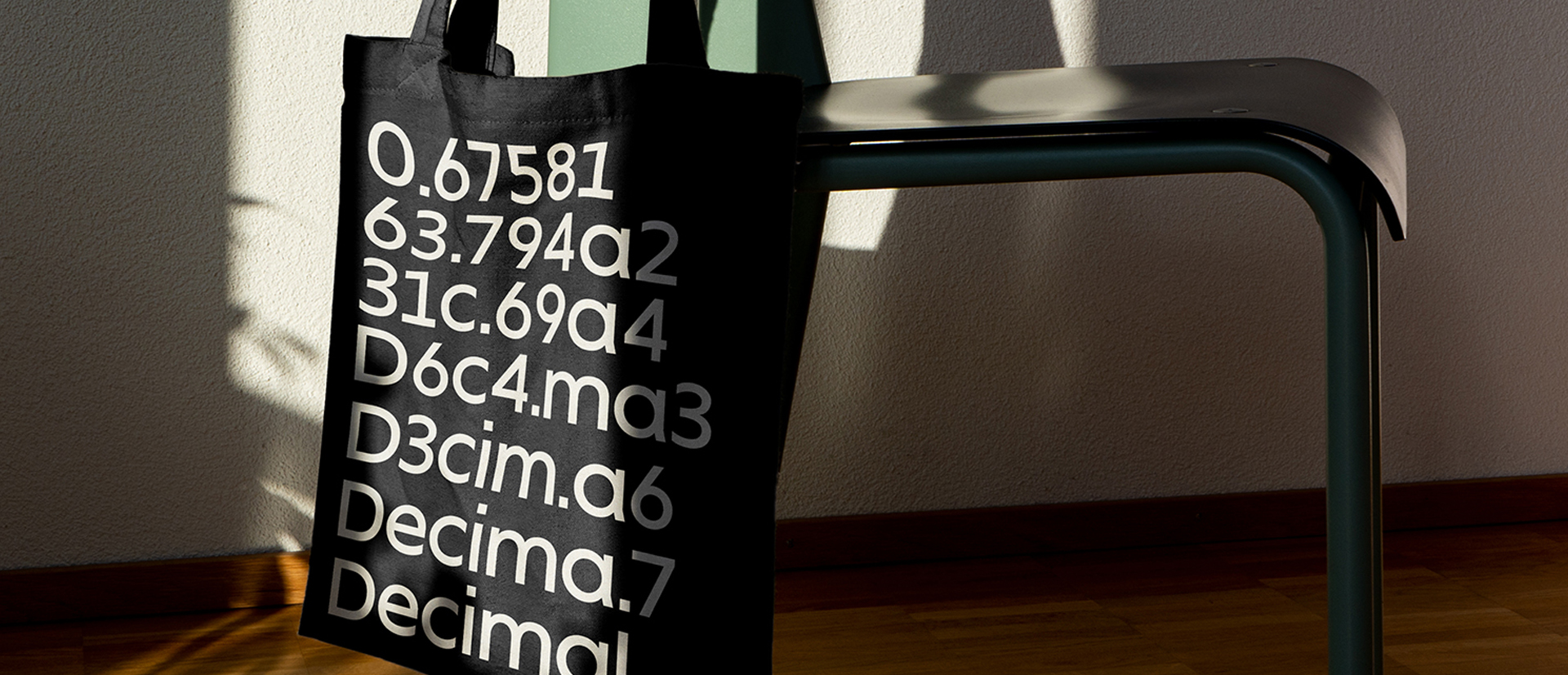
The typeface they have consists only in two styles, a Roman and a Cursive-like which are both far too light for continuous reading. Sámpi includes 4 weights (Light, Regular, Bold and Black) plus an Italic. We also included small caps for titling, several sets of figures and some symbols for texts books as well as some other symbols specifically related to Sámi culture.

In terms of design, Sámpi follows the style of their previous typeface, as otherwise they would not be allowed to use it. However, we had a fair amount of freedom and the result is far from their typeface. We analysed the fonts and did research on children type design. We identified some important problems and solved them within the boundries we had.
The main concern in a typeface which will be used by children is letter recognition, as they have not yet fully develop their reading skills. For example, letters like “a” and “g” share a very similar structure in this particular kind of typefaces, where the only distinctive part is the descender of the “g”. It is known that the lower part of the letter is the less important feature when reading, therefore we decided to make a clear distinction between them by having an “a” with a spur on the top right. This also helped distinguishing “a” and “o”. Children typefaces usually have one story “a”, making “a” usually too close to “o”. Additionally we moved the joint in “a” upwards and narrowed very slightly the “a” to make sure they cannot be mistaken.

More generally, we thought the x-height needed to be taller and we found the old typeface a bit to stiff so Sámpi has a bit of movement which give it a good rhythm helping moving along nicely when reading.

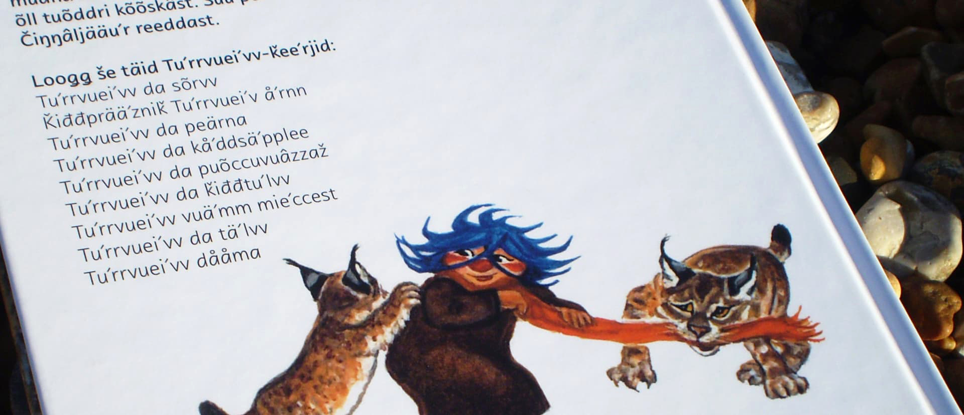
Special attention has been paid in the design of Sámi specific glyphs but also too other diacritics and letters (such as đ) used in the 5 Sámi languages that are still alive. These languages contain a great amount of diacritics and they need to be easy to read and distinguish within a text covered in them. Hannu Kangasniemi helped by giving us very accurate feedback on the Sámi specific glyphs.

The project is still under development, in the future we aim to develop Sámpi Cyrillic to cover Kildin Sámi, spoken in the Kola peninsula, north-western Russia. Unfortunately, this has an added complication as many of their unique glyphs are not yet supported by Unicode (read related article at lettershake).