Mobility through language
For Atipo Foundry
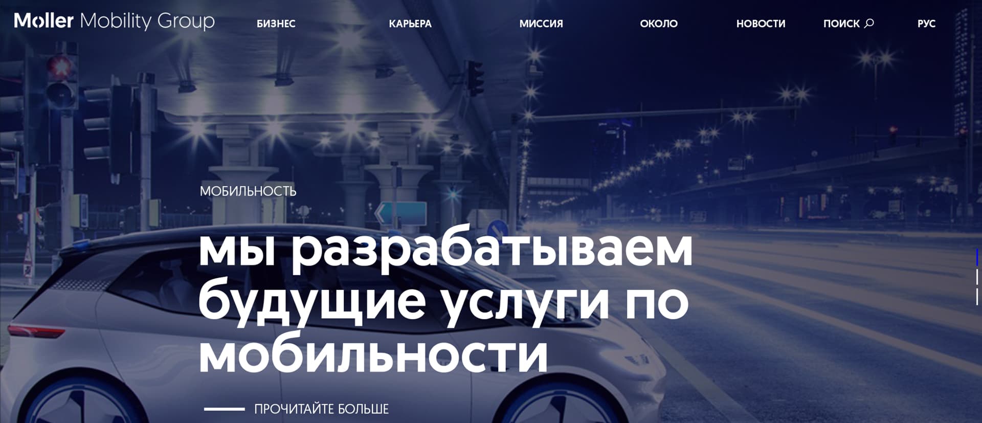
A while ago Atipo, a small studio dedicated to corporate graphic and type design, contacted us to commission a Cyrillic linguistic extension for a two weights modified typeface from their library for their client Moller Mobility Group. This typeface is a geometric sans serif with a very contemporary look which Moller are using as corporate typeface.
We analysed the typeface and looked for the most important characteristics to apply into the Cyrillic without pushing Latin features into the script. In this case simple structures and geometry were the main features from where to build the Cyrillic.

In many typefaces Cyrillic “k” is the Latin one as it is, we rather use a letterform which is closer to the Cyrillic script, and in this specific case it is important because the Latin “k” is too narrow for the Cyrillic context.

In Cyrillic we find some terminals which are different from the Latin, we looked for the most similar existing shapes so those influence the new ones. They are not identical, they just have a clear relationship keeping harmony between both
witting systems.

The case of the Serbian and Macedonian letter Be is special, it is the only one which has this kind of junction and ascender. The applied criteria is that of the Latin, geometric shape and a simple structure. As for the terminal there is a clear relationship with c which works very well.

The x height of the Cyrillic is a little higher than the Latin one. Cyrillic is a wide alphabet with open counter forms, this makes it appear smaller when compared to Latin. In order to compensate this effect we made a little optical correction which puts both writing systems at the same level.