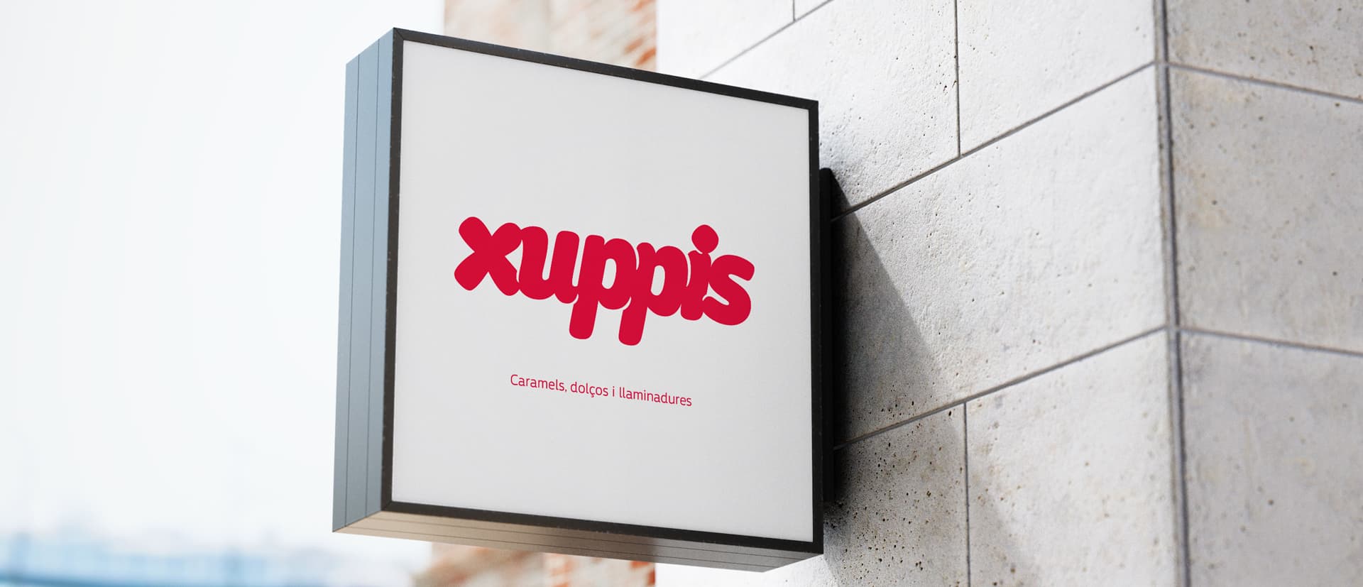
Candy letters
Xuppis is a little candy shop run by a family, they contacted us to re-design their existing logo in which each letter resembled a sweet. We develop a completely new logo, but we keep the concept of candy letters. We decided to convert the whole word into a gummy bear like sweet.

The choosen colours were a bright reddish-pink and white, we wanted to give a clean look which would appeal both kids and adults.