Juicing letters
Designing one's own identity is probably one of the biggest challene a designer can face. When we started developing Letterjuice's identity we did not know were to start, however when we actually sat and did it it came along quite naturally.
There were a few key ideas we needed to comunicat in order to truly express who we are and what we do. Our passion regarding our job, our approach to it and how we view it.
We knew it would be a piece of lettering right from the start, then the concept evolved to the idea of system, as that is wht type is, a system of symbols represinting sounds and ideas.
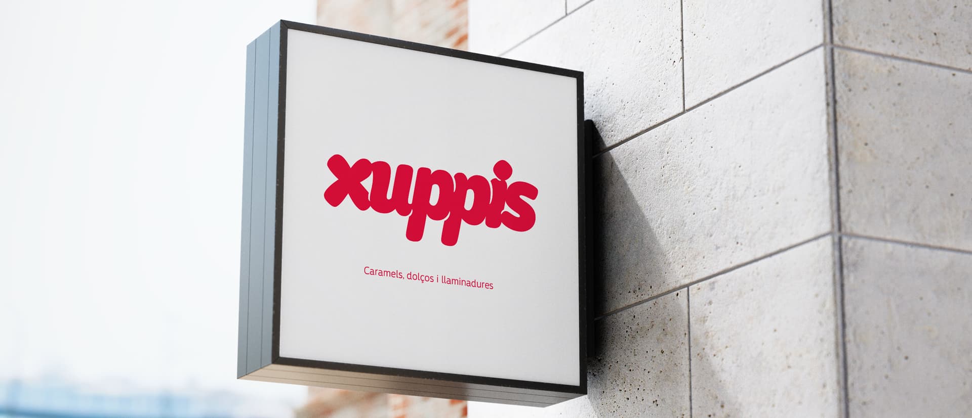
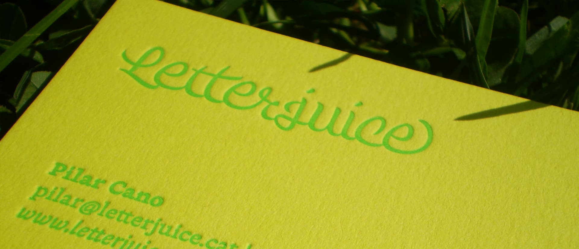
Letterjuice's logo is a system of logos in which there is a base “skeleton” from which other shapes emerge. This also expresses our versatility and the forms we developed showcase our experimental, creative and playful side as well as the accuracy of our work.

Regarding the colour scheme we could not have one or two colours if we were to talk about ourselves. We love colours! So we choose a generous palette of bright colours. The use of the lettering and colours throught our website and colateral set a fresh and friendly environment for our clients.