

Baldufa
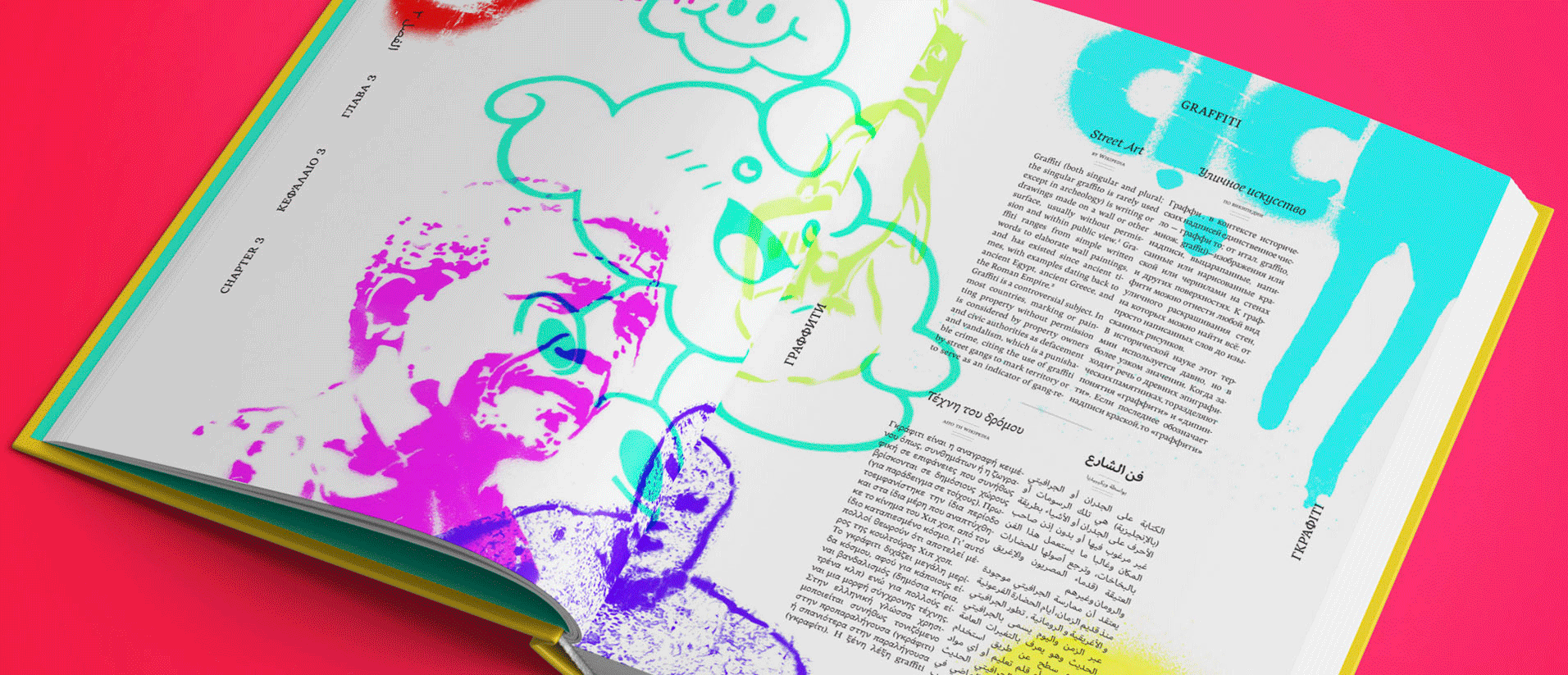
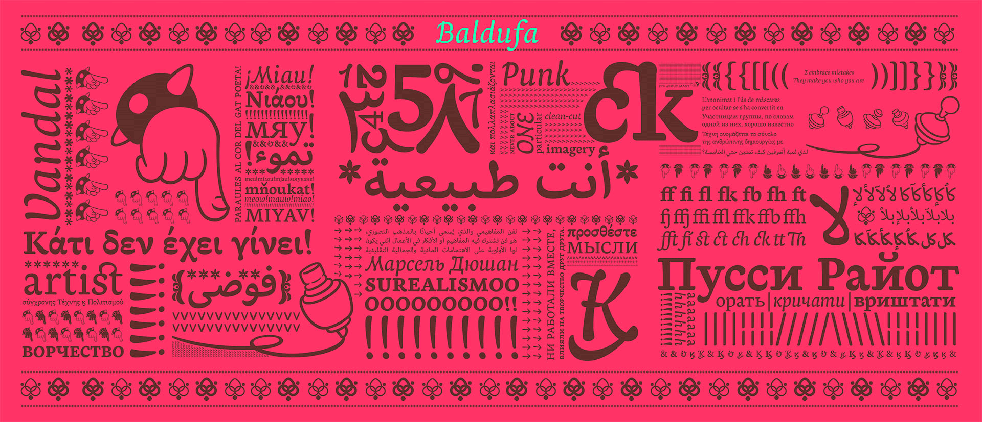
Baldufa is a charming typeface with strong personality, which looks very comfortable in text. There is a search to obtain complicated curves and detailed features, which gives the typeface a touch of beauty and elegance. However, this is also a self-conscious design that claims through the rounded serifs and irregular vertical stems appreciation for quirkiness and human imperfection.
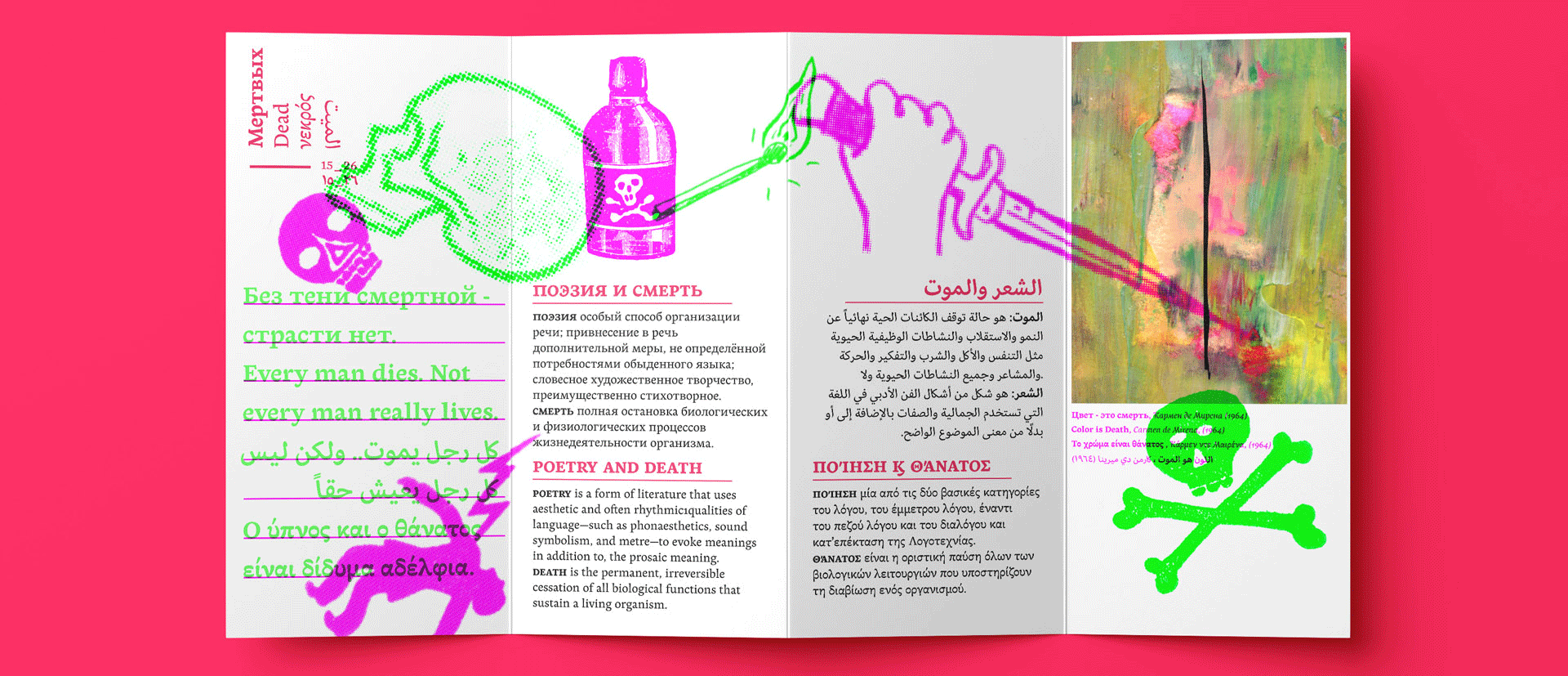
The typeface family is also a multi script project, containing Latin, Arabic, Greek and Cyrillic scripts. The Latin, Greek and Cyrillic consists of Regular, Bold and Italic styles, including Small Caps and Open Type features. Whereas Arabic Naskh includes Regular and Bold weights.
The whole family has been designed to work harmoniously together to help to produce catalogues and small publications of cultural content. We believe that Baldufa is a tinny but nice contribution to build bridges between cultures and this make us very happy!
The letterforms in the Latin are inspired by the slight distortions and idiosyncrasies that came with old printing methods. It has distinct, features such as rounded serifs, irregular vertical streams, ink traps and extremely thin junctions. In the Italic, serifs have been removed to enhance movement and expressivity. These experiments in form have not come at the cost of legibility: The typeface remains suitable for both small and display text.
The letterforms in the Latin are inspired by the slight distortions and idiosyncrasies that came with old printing methods.
The Cyrillic is the closest script to the Latin given the history of the script. The proportions are slightly wider and it contains specific letterforms for specific languages. Although all four scripts have a wonderful matching in terms of texture and colour, linking the scripts very close together, Latin and Cyrillic create a perfect match which makes its use in multi-script publications a very nice option.
We have taken advantage of the fluidity of the script that allows us to bring its visuall expression to the maximum. Curves, modulation and changes in stroke directions have been worked in a way that enhances its expressivity without losing the essence of the original design. Baldufa Greek is the most dynamic design among the four scripts.
To certain extent, the design of the Arabic gathers same interests for experimentation. Baldufa Arabic respects the basic features of Arabic script such as thick stokes in the baseline, multiple vertical axis, genuine stem modulation and good linking between words. However, it steps away from traditional Calligraphic Style. It has rounded top terminals and the traditional contrast between curves and straight stokes has been softened. Letterforms sometimes slightly escapes from tradition in order to obtain more expressivity. Overall, Arabic has been designed to acquire the same elegant and quirky aspect of the Latin.
Awards
• Morisawa Typfeface Design Awards 2012
• TDC Type Design Awards 2013
• ED Awards 2013
• Granshan Type Design Awards 2013 - Arabic
• Horouf Bilingual Type Competition 2014
• Granshan Type Design Awards 2019 - Multiscript
• Best 10 Cyrillic typefaces 2017
• Modern Cyrillic 2019
Language and features support
- Latin
- Arabic
- Standard ligatures
- Discretionary ligatures
- Arabic ligatures
- Arabic discretionary ligatures
- Localised forms
- Small Caps
- Small caps from caps
- Cap spacing
- Case sensitive forms
- Ordinals
- Superiors
- Inferiors
- Numerators
- Denominators
- Fractions
- Lining figures
- Old style figures
- Tabular figures
- Old style tabular figures
- Persa figures
- Urdu figures
- Ornaments
- Arrows
- Hands
-
Latin Latin -
Arabic Arabic -
Standard ligatures Standard ligatures -
Discretionary ligatures Discretionary ligatures -
Arabic ligatures Arabic ligatures -
Arabic discretionary ligatures Arabic discretionary ligatures -
Localised forms Localised forms -
Small Caps Small Caps -
Small caps from caps Small caps from caps -
Cap spacing Cap spacing -
Case sensitive forms Case sensitive forms -
Ordinals Ordinals -
Superiors Superiors -
Inferiors Inferiors -
Numerators Numerators -
Denominators Denominators -
Fractions Fractions -
Lining figures Lining figures -
Old style figures Old style figures -
Tabular figures Tabular figures -
Old style tabular figures Old style tabular figures -
Persa figures Persa figures -
Urdu figures Urdu figures -
Ornaments Ornaments -
Arrows Arrows -
Hands Hands


